CSS Tricks: page’s margin
You probably already noticed that books are made of pages. And you probably already noticed that there are two kinds of pages: rectos and versos. But, did you notice that it causes the layout of these pages to be slightly different?

Many books define different layouts for their pages depending on their side: we generally want the margins to be larger on the outside, so that our fingers can handle the pages without recovering the text. We also want the page numbers to be on the outside, making our lives easier when we want to reach a specific page quickly.
CSS gives a way to define different page layouts for left and right pages:
@page :left {
  margin: 20mm 15mm 25mm 30mm;
  @bottom-left-corner { content: counter(page) }
}

@page :right {
  margin: 20mm 30mm 25mm 15mm;
  @bottom-right-corner { content: counter(page) }
}
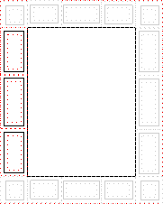
Page margins are divided into many small areas where you can put the content you want: page numbers, current chapter title, fancy footers… These areas have nice default vertical and horizontal alignments, but you can of course change them if you really want to.

Learn more about page margins: